Dashboard
Introduction to iHRIS Dashboard
Welcome to the iHRIS Dashboard, the central hub for managing and monitoring your organization's human resources information. The iHRIS Dashboard is designed to provide a comprehensive overview of key metrics, enabling you to make informed decisions and streamline processes effectively.
Navigating Your HR Landscape
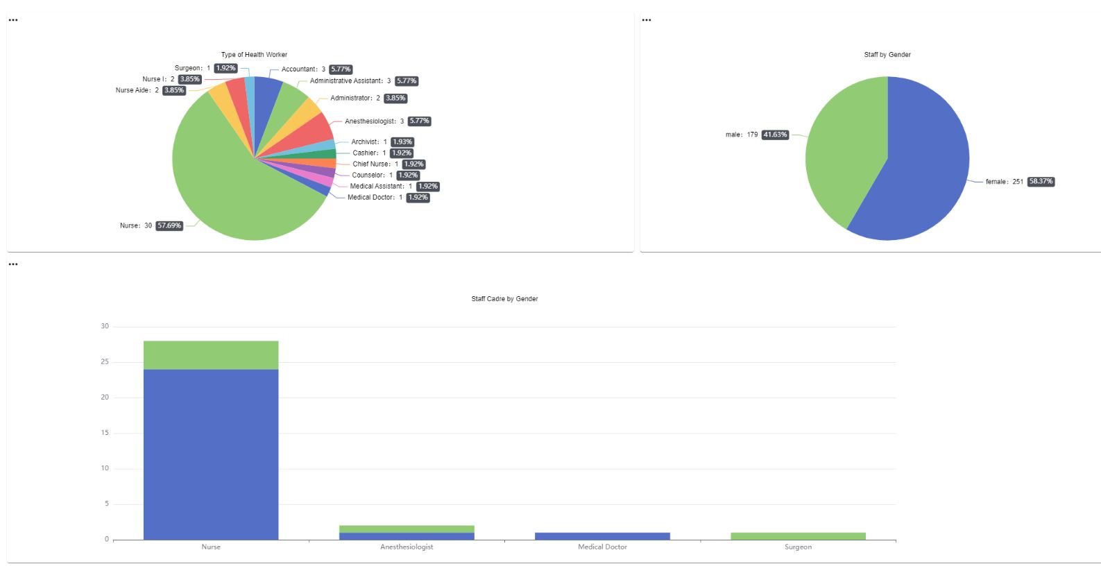
The dashboard serves as a dynamic interface, offering a snapshot of critical workforce data, from employee demographics to performance metrics. Through intuitive visualizations and user-friendly tools, the iHRIS Dashboard empowers administrators to navigate the intricate landscape of workforce management effortlessly.
Key Features
- At-a-Glance Insights: Instantly access crucial metrics, such as headcount, turnover rates, and distribution by department, for a quick overview of your workforce.
- Interactive Visualizations: Dive deeper into your workforce data with interactive charts and graphs, allowing you to analyze trends, patterns, and correlations with just a few clicks.
- Real-time Updates: Keep your finger on the pulse of your workforce with real-time updates on employee status, training progress, and other vital HR indicators.
- Customizable Dashboards: Tailor your dashboard to meet your specific needs by choosing from a range of widgets and arranging them to align with your priorities.
From basic navigation to advanced analytics, iHRIS supports you in optimizing your HR processes.
Dynamic Filtering
Tailor your view by filtering data based on essential fields such as gender, cadre, and job title. This dynamic feature enables you to focus on specific aspects of your workforce, providing the flexibility needed for in-depth analysis.
Customize Visualizations
Personalize your dashboard experience by editing visualizations to match your unique requirements. Adjust charts, graphs, and widgets to create a dashboard that aligns precisely with your organization's goals and priorities.
Chart
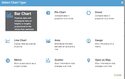
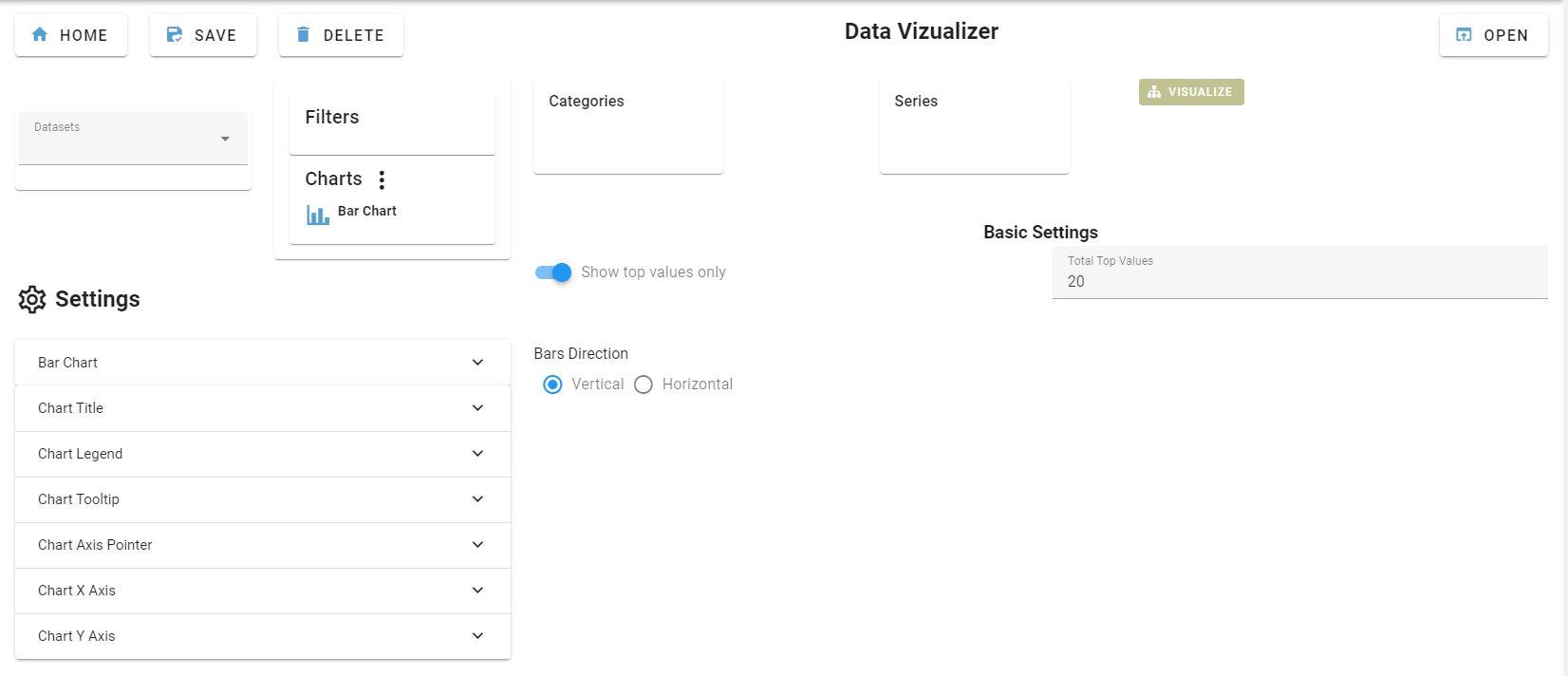
One of the key features of our data visualization tool is the flexibility it offers in presenting data in various chart formats. Selecting the right chart type is crucial to effectively communicate your data insights. Follow these steps to choose the chart type that best suits your analytical goals:
Explore the range of available chart types
Common options include bar charts, line charts, pie charts, scatter plots, and more. Each chart type has its strengths in representing different types of data relationships. Understand Data Characteristics:
Consider the nature of your data
For example, if you are comparing values across categories, a bar chart might be suitable. If you want to show the distribution of a whole, a pie chart could be effective. Understanding your data characteristics helps in selecting the most appropriate chart type.
Analyze Relationships
Determine the relationships you want to highlight in your data. Are you showcasing trends over time, comparing categories, or displaying proportions? Different chart types excel in illustrating specific relationships, so choose accordingly.
Settings
Users can customize the appearance of visualizations based on their preferences. This may involve changing style elements to match individual preference or specific style branding.
Basic Settings
These are simple settings related to the specific visualization chosen.
Settings
These features are specific to the chart chosen and allow users to edit the specific elements of the chart. For example, for a bar chart:
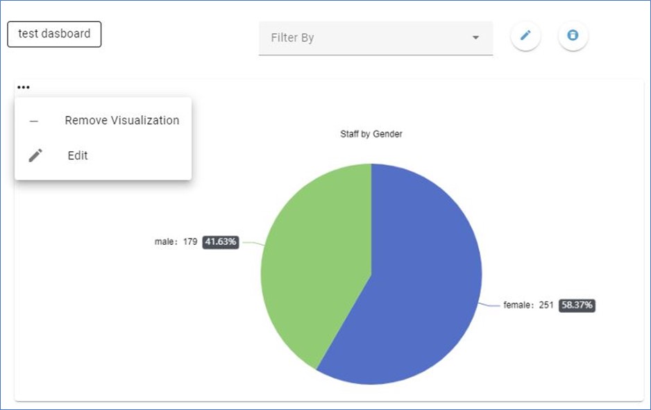
Delete or Rearrange Visual Elements
Take control of your dashboard's layout by deleting unnecessary visualizations or rearranging them to suit your workflow. Your dashboard, your way – streamline your view to highlight what matters most.
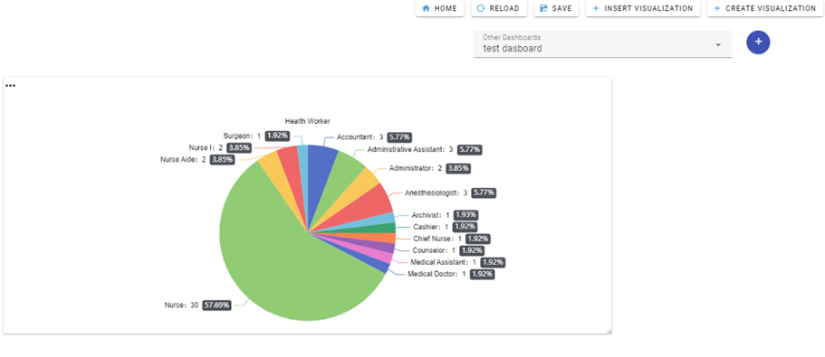
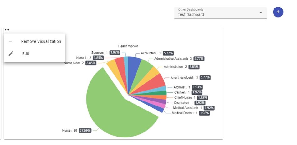
Insert Visualization
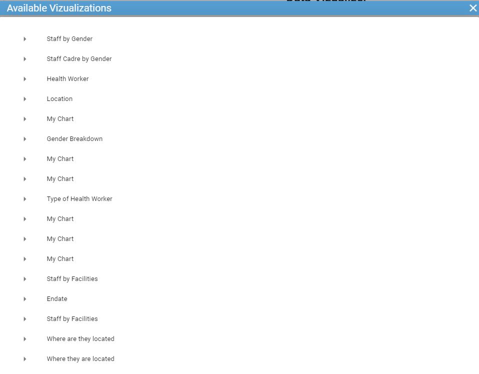
This feature allows you to insert an existing visualization.
Create Visualization
This allows you to create a new visualization based on a selected dataset.

